Inspect Pause. Then move.
An eight-second kinetic typography study with three word beats and a scale emphasis, built from eight editable Chorono layers. Preview the animation here, or select a marked moment to examine the design.
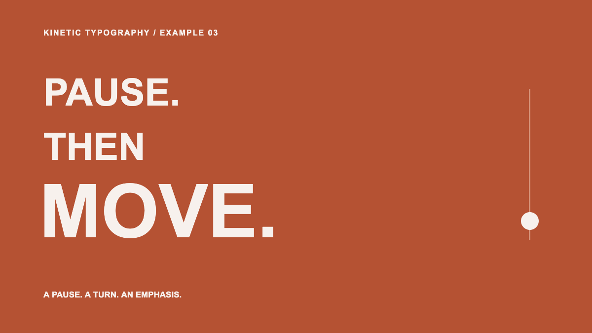
Project notes: 1200 × 675 · 30 fps · 8 named layers · 10 animation tracks. Authored through Chorono MCP with AI assistance; representative frames and the actual exports were checked on November 5, 2026. Scene validation and runtime export returned no warnings. These projects use Arial and native shapes, with no external media files.
Turn a sentence into a visual reading rhythm
Kinetic typography gives type a role in the action. A pause can create expectation. A later word can change the meaning of an earlier one. A change in scale can make one word feel more forceful than its neighbors.
The phrase in this project is “PAUSE. THEN MOVE.” Its first two words use the same 76-pixel font size. “MOVE.” uses a 150-pixel font size and a short scale overshoot. That hierarchy is part of the sentence: the first words establish the pace, and the last word becomes the emphasis.
All three words eventually remain on screen together. The completed frame reads in a clear top-to-bottom order. A small marker travels down the rail to reinforce the word changes; it never passes across the letterforms.
For a title that simply needs a readable entrance, a restrained text animation may be enough. Use a stronger change of pace when it contributes to what the words mean.
Break down the three word beats
| Time | What happens | What to inspect |
|---|---|---|
| 0.0–0.4 s | “PAUSE.” enters from the right and fades in. | The first word establishes the top of the reading order. |
| 1.2–1.6 s | “THEN” enters; the marker moves to the second position. | The gap creates a deliberate pause between ideas. |
| 2.4–3.3 s | “MOVE.” enters, grows past its final scale and settles. | The largest word delivers the emphasis without clipping. |
| 3.3–8.0 s | The whole sentence holds still. | The reader can take in the complete relationship between the words. |
Inspect 1.4 seconds to see the second word during its entrance. At 2.74 seconds the large word is near its scale emphasis. At 3.6 seconds the typography has settled. The project stores that emphasis as separate X and Y scale tracks, so both dimensions can be revised together.
The word entrance lasts 0.4 seconds, but the words start 1.2 seconds apart. Those are separate decisions. Shortening an entrance changes the character of the movement; shortening the interval changes how quickly the sentence is read.
Change the emphasis without losing the sentence
Download the eight-layer project and choose Open Scene JSON in a separate Chorono editor tab. The layers “Word one — PAUSE”, “Word two — THEN” and “Emphasis word — MOVE” identify the main type. The “Word beat marker” layer has its own vertical position track.
Start with one controlled experiment. Removing the overshoot lets you judge whether the large font size already supplies enough emphasis. You can give a connected Claude Code or Codex agent this revision:
Read the Pause. Then move. scene with the chorono skill. Keep the exact words, rust background, cream type and eight-second duration. On “Emphasis word — MOVE”, remove the scale overshoot: go from 86% at 2.4 seconds to 100% at 2.82 seconds, then hold. Change both scale axes together. Preserve the other entrances and marker timing. Show actual previews at 2.74 and 3.6 seconds, validate and save a revised portable project.Compare the two versions at normal speed and at the emphasis frame. The larger movement may feel energetic, while the restrained version may suit a quieter message. Choose based on the tone you need and on whether the sentence remains easy to follow.
To change the copy, keep one clear emphasis word and check its width at the largest animated scale. The animation skills guide explains how the agent reads and preserves the existing scene.
Review movement, sound and the final hold
This study has no audio track. Its beats are visual timing choices. If you later add narration, align word changes with the actual recording and listen to the result; a silent frame preview cannot establish sound synchronization.
Check the transition into the final hold. “MOVE.” should stop changing size while the whole sentence remains readable. Test the narrow layout where the animation will be embedded. Use the surrounding page text to preserve the sentence for readers who cannot view the canvas or prefer a still image.
The portable JSON keeps the typography and keyframes editable. The runtime export used by the player contains the playback data. For a larger project with multiple cards and labels, explore the motion graphics workflow and its delivery checklist.