Play the Make it clear title
A six-second text animation with two staggered lines, an extending underline and a reading hold, built from seven editable Chorono layers. Preview the animation here, or select a marked moment to examine the design.
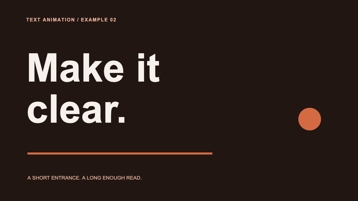
Project notes: 1200 × 675 · 30 fps · 7 named layers · 8 animation tracks. Authored through Chorono MCP with AI assistance; representative frames and the actual exports were checked on November 5, 2026. Scene validation and runtime export returned no warnings. These projects use Arial and native shapes, with no external media files.
Choose an entrance that suits the message
A text animation should help a reader find and understand the words. Choose an effect around the reading order and the final position, then keep enough still time for the message to be understood.
- Fade: introduce a title in place
- Animate opacity when the composition already has a clear reading order. The words stay in the same position while becoming visible.
- Slide: give the entrance a direction
- Use a short position change to bring text into place. Inspect the first frame and the path so the words remain inside the intended composition.
- Stagger: reveal lines in a sequence
- Offset the start times of separate text layers. A small overlap can connect two lines while keeping their order clear.
“Make it clear” uses two whole text layers. The first line fades upward over 0.9 seconds. The second starts 0.3 seconds later and moves slightly from the right. That small overlap keeps the lines connected. A rust underline extends only after the title has settled, so the entrance has one focal action at a time.
The words remain ordinary editable text in the project. You can replace the copy and adjust font size or line breaks without recreating an image. For longer copy, decide the line breaks before adding more movement.
Read the timing of this text animation
| Time | What happens | What to inspect |
|---|---|---|
| 0.0–0.9 s | “Make it” fades in and rises 32 pixels. | The first line moves into a stable position. |
| 0.3–1.2 s | “clear.” fades in and slides 32 pixels left. | The stagger helps the reader follow the two lines. |
| 1.2–2.1 s | The underline extends; the circle settles by 1.8 s. | The accents support the title without touching it. |
| 2.1–6.0 s | The complete title stays still. | The main message has a 3.9-second reading hold. |
Use the marked 0.6-second preview to inspect the overlap between the two entrances. At 1.6 seconds the underline is still growing. At 2.6 seconds the whole title is stationary. Those frames answer different questions; the final poster alone cannot show whether the entrance feels rushed.
The six-second duration is a design choice for this short title. It is not a reading-time rule for other messages. Longer text, unfamiliar words and a smaller display may need a longer hold or a simpler composition.
How to create animated text in Chorono
- Open the editor. Follow the local setup guide, download the project above and choose Open Scene JSON in a separate Chorono editor tab.
- Change the words. Select “First line — Make it” and “Second line — clear”. Replace the copy, then adjust font size and line breaks until the finished title fits.
- Set the entrance. Inspect the position and opacity tracks. Preserve the original fade and slide or change one property at a time.
- Check the reading hold. Scrub the entrance, play the whole title and read the final message at its intended display size.
- Save an editable copy. Keep the portable project so you can reopen it and revise the wording or timing later.
The example uses whole text layers for the two lines. A stagger between these layers gives you line-by-line control. To try word-by-word timing in this exercise, place each word you want to move independently on its own text layer and plan its entrance.
You can ask a connected agent to make the same revision. Install the Chorono animation skills, connect the editor tab and name the text layers in your brief. For example:
Use the chorono skill to read the Make it clear scene. Change the first title line to “Keep it” and the second to “simple.” Keep the dark background, cream text, rust accents and six-second duration. Adjust the second line’s font size only if it needs more room. Preserve the stagger and the final reading hold. Inspect at 0.6, 1.6 and 2.6 seconds, then validate and save a portable project.To start a new design, include the exact copy, canvas dimensions, entrance order and hold duration in the prompt. The Claude animation tutorial shows the full connection and prompt workflow. You can use the same authoring skill with Codex.
Choose a text animator around your next edit
Before using an animated text generator or text animation software, decide what you will need to change after the first preview. Check whether you can replace the wording, adjust individual entrances, keep the source and deliver the result in the format your project needs.
| Your next edit or delivery | How this example helps you evaluate it |
|---|---|
| Change the copy | The two title lines remain editable text. Try the longest wording you expect to use and check its line breaks. |
| Adjust the rhythm | Separate opacity and position tracks let you inspect each line’s entrance and the final hold. |
| Work in a browser | The preview plays on this page. Creating and editing the title uses the locally installed browser editor. |
| Keep the source | Download the portable Chorono project, save your changes and reopen the file for the next revision. |
| Deliver to a website or video | This page demonstrates runtime playback and an editable JSON download. If you need an MP4 or GIF, test that delivery step in your production workflow. |
The Chorono text animator is part of the free, MIT-licensed editor. You can change the scene directly or connect Claude Code or Codex for agent-assisted editing. Access to those agent services is managed separately.
To understand a position or opacity track before changing it, use the keyframe animation guide. The easing comparison shows how the same start and end values can move at different speeds.
Check reading time, contrast and small screens
Play the title once without scrubbing. Read it as a sentence. If your eye is still tracking the motion when the next action starts, reduce the travel or extend the hold. Try the longest copy you expect to use, not only the short sample.
Check the main title at the size where it will appear. This project has a 1200 × 675 source canvas; scaling it into a narrow phone layout makes every letter smaller. Its small label and footer are supporting details. Put essential information in the large title and in accessible page text, rather than relying on tiny text inside an animation.
The preview starts on a still poster and plays only when requested. Its time controls let you inspect a frame without continuous movement. When embedding your own animation, provide a useful still state, a pause control and an accessible text equivalent for the message.
If the words themselves should express a change of pace or emphasis, continue to the kinetic typography study. For a larger text-and-shape composition, see the motion graphics software workflow.